
I really love colour challenges, it is so nice to see which colours should be combined, think about what atmosphere they create and what kind of card would fit.
This weeks CAS challenge is a layout AND colours! The colours are: Doffodil Delight, Night of Navy and Wild
Wasabi, what a beautiful combination! First, I thought about something flowery romantic, but then I could imagine something to do with travel and adventure. Maybe there is some red missing, but I
really felt this could work.
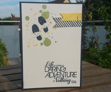
So this is the result: I used all kinds of stamp sets:
- sentiment and footprint:"Daring Adventure"
- small spots: "French Foliage"
- large spots and blue stripes: "Gorgeous Grunge"
- Dotted banner: "Tape It"
I used a stapler for the banner elements to make it look more rustic and travel-like.The rest is pretty straight forward...
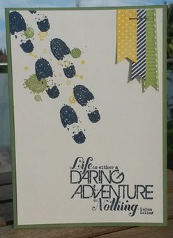
I made a second version altering the position of banners, adding a third and stamping more footprints. I prefer the vertical banners, but I like the simplicity of just one footprint.


Kommentar schreiben
Jane (Dienstag, 04 August 2015 10:00)
Super cards Katharina. I'm loving the single footprint best too and it looks so good showcased against the splots. Thanks for playing at CC&S.
Patricia H. (Mittwoch, 05 August 2015 05:09)
That shoeprint stamp is too cool! I really like how these cards are appropriate for either a male or female recipient. You did a wonderful job with our CC&S double challenge!
Louise (Freitag, 07 August 2015 12:55)
Really love this take on the double challenge. Fun with those footprints. Thanks for playing along at CC&S
Louise x